What Is Technical SEO? Basics and Best Practices

Technical SEO: Optimizing Your Website for Search Engines and Users Technical SEO focuses on enhancing your website’s ability to be effectively crawled, indexed, and rendered by search engines, while also prioritizing user experience factors like site speed and mobile-friendliness. By implementing technical SEO best practices, you can improve your visibility in search results and potentially drive more organic traffic to your site. This article will cover the essential elements of technical SEO and provide actionable tips to optimize your website for better search engine performance and user satisfaction. Let’s explore the world of technical SEO together. Why Technical SEO is Important: Technical SEO is crucial because it directly impacts how search engines can crawl, access, and index your website’s content. Without proper technical optimization: Search engines may not be able to discover or understand your pages, making your content invisible in search results – even if it’s valuable. Slow loading times and poor mobile experiences can frustrate users, signaling a bad user experience to search engines, which hurts rankings. Technical SEO ensures your site’s architecture, code, and user experience allow search bots to effectively crawl, index, and interpret your content for maximum visibility in search. Neglecting it can lead to major traffic and revenue losses. Understanding Crawling and How to Optimize for It Crawling forms the backbone of search engine operations. Search engines discover new pages by tracing links from previously crawled and indexed content. For instance, whenever fresh blog articles are published on our site, we incorporate links to those new posts on the main blog page. This allows search crawlers, during subsequent crawls of the blog homepage, to identify and follow those newly added links, thereby finding the recently published content. Designing an Optimal Site Architecture for SEO A website’s architecture, also known as site structure, refers to the organizational framework that governs how pages are interconnected through internal linking. Crafting an effective site architecture is crucial for facilitating efficient crawling and discoverability of your content by search engines. Key considerations for an SEO-friendly site architecture include: 1. Logical categorization and organization of content into appropriate sections or categories. 2. Implementing a clear internal linking structure, with descriptive anchor text, to guide both users and crawlers seamlessly between related pages. 3. Utilizing breadcrumb navigation to provide context and enhanced navigability within your site’s hierarchy. 4. Avoiding excessive subfolders or nested directories, as these can create unnecessary complexity and hinder crawling efficiency. 5. Consolidating similar or related content onto fewer pages to reduce duplication and enhance topical focus. Submit Your XML Sitemap to Google Submitting an XML sitemap to Google can significantly improve the discoverability of your website’s pages. This sitemap file provides a comprehensive list of your important pages and their locations, helping search engines efficiently locate and crawl your content. An XML sitemap is especially beneficial if your site has numerous pages or poor internal linking, as it ensures search engines like Google are aware of all your pages. By submitting this roadmap, you facilitate crawlers in finding and indexing your full range of content for better visibility in search results. Your sitemap is usually located at one of these two URLs: yoursite.com/sitemap.xml yoursite.com/sitemap_index.xml Once you locate your sitemap, submit it to Google via Google Search Console (GSC). Go to GSC and click “Indexing” > “Sitemaps” from the sidebar. Then, paste your sitemap URL in the blank field and click “Submit.” After Google is done processing your sitemap, you should see a confirmation message Understanding Indexing: Getting Your Content in Search Engines After crawling, search engines analyze and index your website’s content into their huge databases of webpages. For your pages to appear in search results, they must be indexed. To check if your site is indexed, use the “site:” operator search on Google or other search engines. For example: “site:yourdomain.com” shows approximately how many of your pages are indexed. Regularly checking with the “site:” search allows you to monitor if search engines can properly index and discover your content. Use the Noindex Tag Carefully The “noindex” tag is an HTML meta tag that instructs search engines not to index a specific page: <meta name=”robots” content=”noindex”> Place it in the <head> section. Use noindex selectively on pages you don’t want indexed, like: Thank you/confirmation pages PPC landing pages For important website content, avoid using noindex so search engines can properly index and surface those pages in results. Refer to guides on proper robots meta tag usage to prevent accidental noindexing mistakes that could hurt your site’s visibility. Implement Canonical Tags Where Needed When Google finds duplicate content across multiple pages on your site, it can get confused about which version to index and rank. This is where canonical tags are useful. The canonical tag tells Google which URL is the master version that should be indexed and ranked. Place this tag in the section of both the original and duplicate pages to clearly signal the canonical URL to Google. This avoids duplicate content issues and ensures the right page gets indexed properly. Additional Best Practices for Technical SEO While creating an SEO-friendly site structure, submitting your sitemap to Google, and using noindex and canonical tags appropriately are crucial for getting your pages crawled and indexed, there are further steps you can take to ensure your website is fully optimized for technical SEO. Here are some additional best practices: 1. Secure Your Site with HTTPS HTTPS, or Hypertext Transfer Protocol Secure, encrypts data transmitted between a user’s browser and your website, protecting sensitive information from being compromised. Since 2014, HTTPS has been a ranking signal, indicating to search engines that your site is secure. You can easily check if your site is using HTTPS by looking for the lock icon in the browser’s address bar. If your site isn’t secure, consider obtaining a free SSL/TLS certificate from Let’s Encrypt and redirecting HTTP traffic to HTTPS to establish a secure connection. 2. Address Duplicate Content Issues Duplicate content occurs when the same or similar content appears on multiple
What is Responsive Website? | Why Responsive Websites Matter?

How Responsive Design Works (Grids, Images, Media Queries) In today’s world, the internet has become one of the most important forms of media. Internet usage is primarily done through desktop computers, tablets, laptops, and mobile devices. If your business operates online, and your website is not optimized for mobile devices, then you are likely falling behind your competitors who have responsive websites designed for their business. Recent years have seen rapid technological growth, with new devices coming to market with impressive features. People are excited to buy and use these devices. You can’t assume business customers will only use desktop computers for online searches. If your website is not responsive, visitors will immediately abandon it, resulting in no conversions. Don’t lose potential customers. You need a great-looking website that is also optimized for mobile devices. Many current websites use the desktop version, which provides a poor user experience on mobile. What is Responsive Website? A responsive website adjusts its layout and content to fit the screen size of the device being used to view it. Rather than creating separate sites for different devices, a responsive design rearranges elements to provide an optimal user experience on any screen. With the rise of mobile-first indexing, having a responsive, mobile-friendly website has also become an important ranking factor on search engines like Google. Key aspects of responsive design include: Fluid Layouts: The website’s layout and content automatically adjust based on the user’s screen size and device capabilities. Flexible Media: Images, videos, and other media resize to fit the available screen space. CSS Media Queries: Use of CSS media queries to apply different styles for different screen sizes and device types. Why Responsive Websites Matter? Having a responsive website is really important these days. A responsive website can change its layout and content to look good on any device – phones, tablets, computers, etc. This matters a lot because: Enhanced User Experience: A responsive website ensures visitors can easily navigate and engage with your content, no matter the device they’re using. Improved Accessibility: Responsive design benefits users with disabilities who may rely on smaller screens or assistive technologies. Better Search Rankings: Search engines like Google prioritize mobile-friendly, responsive websites in their rankings. Higher Conversions: A well-designed responsive site keeps visitors engaged, leading to increased conversion rates. Future-Proof Design: As new devices and screen sizes emerge, a responsive site will adapt, providing a consistent experience. Cost-Effective Maintenance: Maintaining a single responsive website is more efficient than managing separate mobile and desktop versions. Conclusion Responsive web design is essential in today’s multi-device world. It ensures an optimal user experience by seamlessly adapting content and layout across devices. Responsive design also improves search visibility, as search engines prioritize mobile-friendly websites. Need a responsive web designer in Dehradun? We can help. Work with our Axel Web Technologies team for a custom responsive website. To keep visitors happy, go responsive – it adapts your site to any device. Partner with us for a responsive website that delights users.
Static vs. Dynamic Websites: Selecting the Perfect Fit for Your Requirements

Static vs. Dynamic Websites: Selecting the Perfect Fit for Your Requirements March 9, 2024 Overview If you’re exploring website options, you’re likely wondering about the differences between static and dynamic websites, and which approach would be best for your business needs and website design. A key consideration is whether a static or dynamic website will better serve your requirements. This choice will impact how your website’s content and data are stored and presented to users in their web browsers. Let’s take a closer look at the major distinctions between static and dynamic websites. I’ll break down the basic definitions, advantages and disadvantages, technical architectures, examples, and different types of each. This should help simplify your decision-making process and allow you to determine the right fit for your website. The goal is to provide you with a clear understanding of the static versus dynamic website landscape, so you can make an informed choice that aligns with your business objectives and website design preferences. Introduction At its most fundamental level, a web page is simply an HTML file displayed in a web browser. When multiple interconnected web pages form a collection, that becomes a website. In essence, a website is a set of HTML files stored on a server and presented to users through a browser. Understanding this basic display process is key to grasping the core differences between static and dynamic websites. The core distinction is that static websites have a fixed, rigid display, appearing the same to all users. In contrast, dynamic websites have a flexible display, adapting the content and layout based on various factors. Let’s explore these differences in more detail. What is Static website? As the name suggests, “static” means unchanged or unmoving. In the context of websites, a static website has a fixed, rigid layout and content that does not change, with minimal interactive elements. These aspects can only be modified by the website developer. Static websites are relatively easy to create and maintain compared to their dynamic counterparts. Let’s dive deeper into how static websites technically function. As we established earlier, a website is a collection of web pages stored on a web server and displayed in a browser. For a static website, this display process works as follows: The website is a set of pre-built HTML, CSS, JavaScript, and/or Bootstrap files. When a user accesses the website through a URL, the server simply retrieves and presents the specific web page and associated files requested. Crucially, the server does not make any changes to the content or layout before delivering the page. The details and elements will appear identical to all users, as the website’s components are static and constant. This is the key distinction – static websites have a fixed, unchanging presentation, irrespective of the user accessing the site. That said, static websites can still be designed to be visually appealing and interactive to an extent. But the core characteristic is that the content and layout remain the same for every visitor. Examples of Static Website Some of the examples where static websites are used are: Web Landing pages Informational websites Portfolios Resumes Brochures Key features of Static website Simplicity: Static websites are simple and straightforward to build, with fixed web pages, content, and design. Fast Loading: Static web pages have fast loading times since there is no server-side processing required. Cost-Effective: Static websites are typically more cost-effective to develop and maintain, as they require less infrastructure. Security: Static websites are very secure, as they don’t involve complicated processes or data generation, resulting in fewer vulnerable aspects. Hosting Ease: Static websites are easy to host, as they can be served from simple web servers or even content delivery networks (CDNs). Reliability: Static websites provide consistent data to all users, making them a reliable option. No Database Required: Static websites do not require a database, further simplifying their architecture. These key features highlight the straightforward nature, performance, cost-efficiency, security, and hosting flexibility of static website designs. Advantages and Disadvantages of Using Static Website Advantages of Static Websites: Easy to develop and display Faster loading times Better SEO ranking Cost-effective and timely No database or server storage needed Disadvantages of Static Websites: Limited user interactivity Rigid content and design Developer-dependent changes No user accounts or profiles Scalability limitations What is Dynamic website? Dynamic websites are the direct opposite of static websites. As the name suggests, “dynamic” means constantly changing and evolving. This is precisely what defines dynamic websites – their content, design, and display elements are in a state of flux, able to be updated and personalized. Unlike static websites where the developer has full control, dynamic websites allow clients and users to actively change and interact with the various elements. This flexibility leads to increased personalization and user engagement, which can translate to higher conversion rates. Let’s dive into the technical workings of dynamic websites. To support the interactive and active elements on the frontend, the backend architecture needs to be more complex and intricate. Rather than storing separate HTML files, dynamic websites generate web pages on-the-fly in response to user requests. The server extracts information from databases and builds the HTML file accordingly, before sending it to the user’s browser. This is the key difference – dynamic websites’ servers make changes before displaying the web page. The details and elements presented can vary for different users and visitors, as the website’s components are dynamic and adaptable. Dynamic websites are highly complex systems, but this complexity unlocks greater opportunities for creativity, personalization, and updates based on user demographics and traffic patterns. The ability to easily modify content, design, and display gives dynamic websites an edge in engaging users and driving conversions. Examples of Dynamic Websites Some of the examples where static websites are used are: E-commerce Sites Social Media Platforms Streaming Services News and Media Outlets Common Technologies for Dynamic Website Development PHP PHP is a server-side scripting language specifically designed for web development. It is a vital component of dynamic website architecture, allowing
WHAT IS CLOUD COMPUTING?

If you’re unsure about what Cloud Computing is, you are probably among the 95% of people that are already using cloud services, like online banking and social networks, but don’t realize it.
How To Fix The Http 503 Service Unavailable Error In WordPress

Running into errors on your WordPress website is often daunting. Most errors offer some clue as to what caused them, making it easier to troubleshoot. Unfortunately, the 503 Error isn’t as simple and doesn’t offer the same information.
Ultimate Guide To Web Optimization (Tips & Best Practices)

Millions of people rely on GoToMeeting. You can too. Start your free trial today.
Do You Know What a Rest API is?
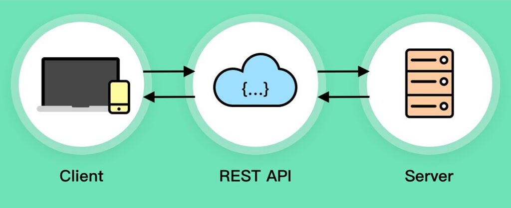
A quick post to explain what a REST API is and how it can be used. I’m clearly making no assumptions about what you know and this is a very brief explanation of a can be very complex topic.
Why Use a CDN For Images? Here Are 7 Reasons

Unless you’ve been living under a rock for the last decade, you already know that a content delivery network (CDN) is a technology aimed to deliver content to users faster. What you may not know is that besides page load speed improvement, a CDN can bring a whole bunch of other benefits including better security, availability, and bandwidth savings.
What is a CDN?

A content delivery network, commonly referred to as CDN, is a network of edge servers strategically placed across the globe with the purpose of delivering digital content to users as fast as possible. When a user makes a request it is routed to the nearest CDN edge server, which significantly reduces the latency. A CDN allows all users, no matter the geographical location, to have fast loading content for an unquestionably improved experience.
Image SEO Best Practices

SEO is a vast term that collectively looks into different search engine optimization strategies. Some strategies take time to get implemented deliver results whereas some are quick fixes. Brands that just have launched their maiden SEO campaigns usually overlook small steps and prefer to pamper big one.